Case Study
coldpress natural extractsA bold, new approach to a timeless ingredient
Intro
when everyone else zigs, it’s time to zag
Jesse Emmers and her team are obsessed with quality. As a Pastry Chef for some of the best restaurants in the country for the past 15 years, she learned that when you source the best ingredients, the food speaks for itself.
That’s why she created COLDPRESS Natural Extracts. Their line of all-natural extracts are always made from the best ingredients and never heated, so the flavors remain fresh, light and true to the way nature made them.
Jesse had a great product, but she needed a unique name and look that would stand out on shelf and present their product in a fun and interesting way.

the goal
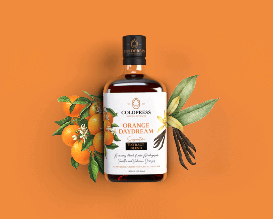
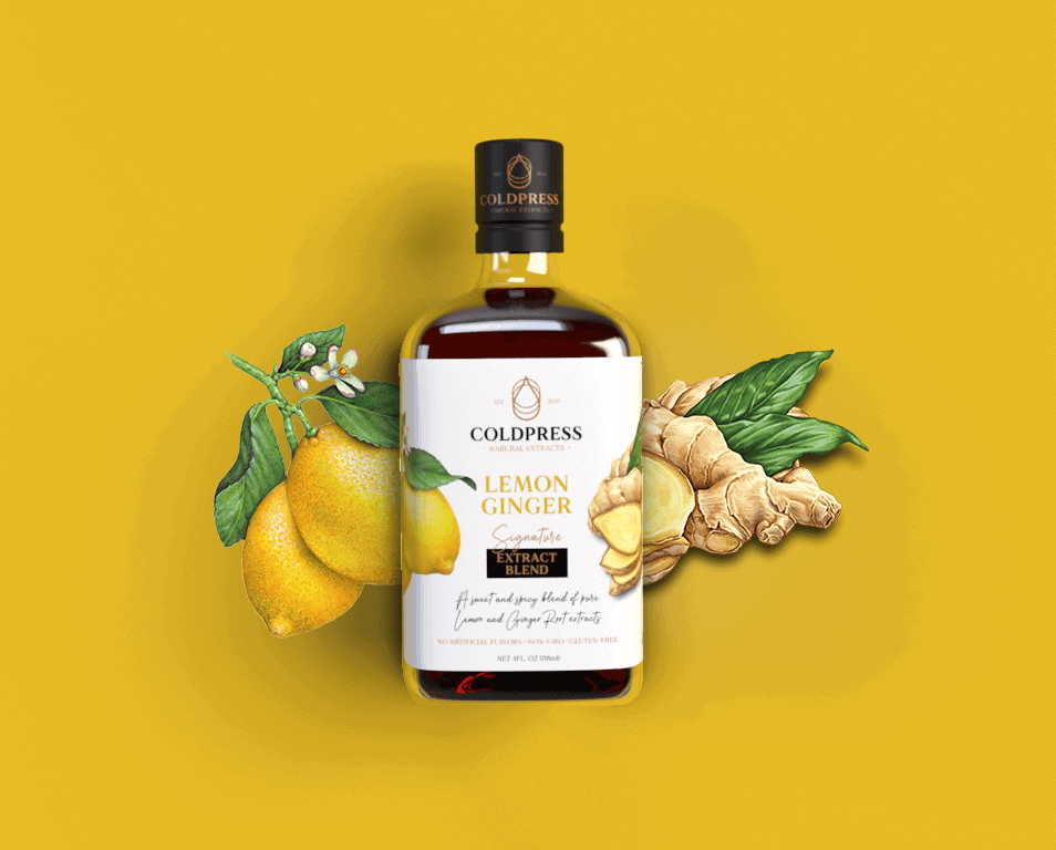
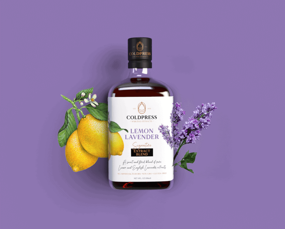
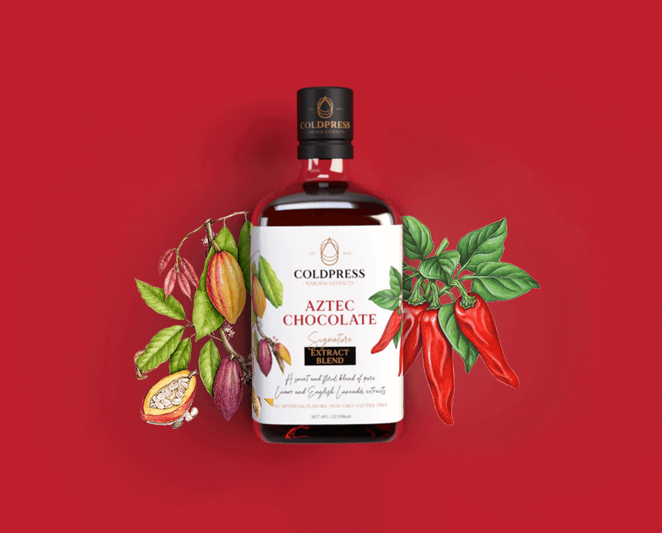
Create an identity and packaging that emphasizes their unique blends, passion for quality and allows the ingredients to be the star of the show
Details
breathing new life into a stale category
Challenge
There are a lot of players in the “extracts” game, but we wanted to set COLDPRESS apart from the pack by giving them a clean and fresh look with the flavor appeal that their unique extract blends deserve.
-
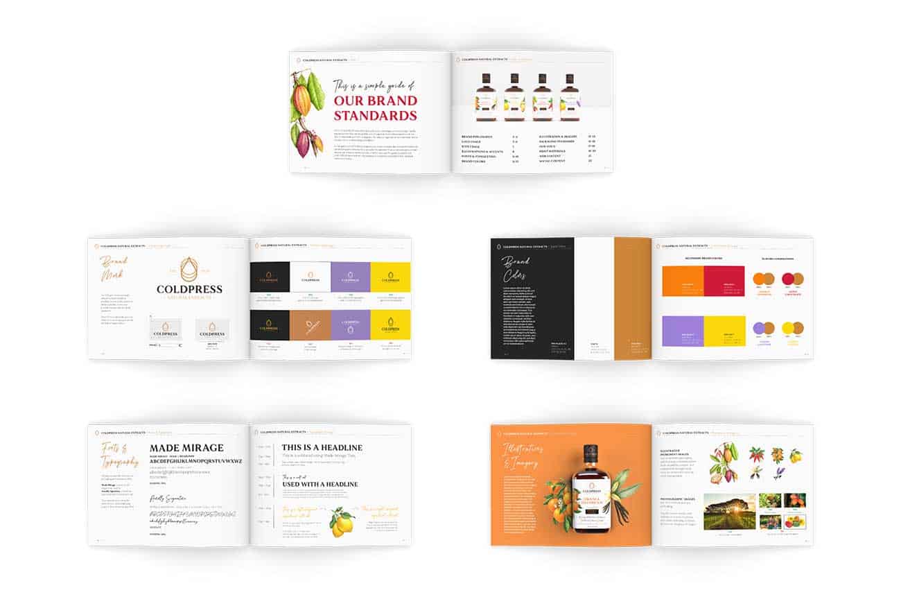
Their Logo/Word Mark should be simple, clean and modern
-
The packaging design must appeal to the gourmet market, but also be approachable
-
Packaging must clearly state the flavor, ingredient details, farm info and benfits (non-GMO, all natural, gluten-free)
-
Packaging must have flavor appeal and verbiage to entice the consumer
-
Packaging must clearly show that these are “Signature blends”
process
Flavor extracts have been around as long as people have been cooking. What we needed to uncover was what makes this one different. In the end, it was as simple as the extraction method that they use…
a triple-filtered COLDPRESS.
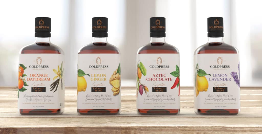
To stand out on shelf we decided to use an unorthodox bottle for the category that is more reminiscent of a miniature spirits bottle and has a more premium feel. To keep the design approachable and playful, yet still “artisanal”, we incorporated custom hand-drawn fonts, swooping “call-out arrows” and illustrative ingredient imagery.
Clean, simple and fun.


the outcome
coldpress natural extracts
